A (More) Welcome Introduction
Content Design, Learning Experience Design, 2022
Background and Challenge
One of my first assignments as an intern at Workday was to reimagine the introduction experience available to Extend users. One special trait of Workday Extend is that there are multiple development, API, and app building tools available and a plethora of proprietary jargon. My job was to find a way to define and explain these highly technical and potentially overwhelming concepts in a comprehensive format so that a "low-code" or non-technical user may be able to effectively use the platform.
The Team
-
Product Manager
-
Engineering Lead
-
Instructional Designer
-
Customer Advocate
-
Technical Writer
-
Inclusivity Designer (Consult)
-
UX Designer (myself)

Beginning to End Comparison
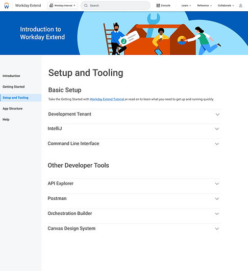
The original "Introduction" experience of Workday Extend was almost exclusively made up of text paragraphs with misleading headers and overwhelming walls of information. As this was my first assignment at Workday and I myself was already overwhelmed by the introduction experience, it was easy to conclude that other users were most definitely feeling similarly.
How Might We...
-
Reduce cognitive load?
-
Cater to the different learning styles of each user?
-
Guide users to a starting point in their learning journey?
-
Add imagery and fun visualization?


Initial Research
As I was playing around with low fidelity mockups, I completed some discovery research.
1. User Survey in order to decipher current users' dominant preferred learning styles.
The results of the survey proved that most users prefer hands-on learning through interactive tutorials, as opposed to video, documentation, and podcast resources.
2. User Card Sort in order to determine current users' expectations for information architecture.
The open card sort activity instructed participants to organize various topics related to Workday Cloud Platform into un-named buckets. The results of this activity greatly helped solidify what content users expect to see and where.

3. 1:1 Consultation with Inclusivity Designer in order to address current cognitive overload and other potential accessibility issues.
One of the most insightful conversations I had during this project was my 1:1 with an Inclusivity Designer. This designer confirmed my suspicion that users were most likely experiencing cognitive overload while accessing the current introduction experience and helped me understand the accessibility issues that were stunting my users' learning journeys.
Customer Journey
Workday Cloud Platform's main products help users build custom apps and unfortunately, the learning curve for these products is intense and oftentimes convoluted. I wanted to make sure that users understood their own intended journey. To do so, I started by creating a diagram to explain the proprietary app building process. My initial intention was for this diagram to be intractable component, however, due to engineering constraints this did not make it to the final solution but you'll see it in many early iterations.

Content Curation & Wireframing
The first few weeks of this project were spent arranging a 10+ page document of new content that was to be displayed on the pages of the introduction experience. I and a Workday Extend instructional designer spent about one month synthesizing the results of the survey and card sort that I conducted with Extend users and then using those results to write topics and content. We then collaborated with a technical writer to ensure that all content was written to Workday standards.
In tandem with content writing, I spent a considerable amount of time exploring all the different ways content could be stored on the pages of the experience. I experimented with cards, tables, accordions, lists, diagrams, and even split-up paragraphs. During this wireframing stage, I would oscillate between product team reviews and design team reviews where I would gather feedback over and over again, until I had come to what both teams agreed was the ideal design. This process took about one month.


Creating Small Delights
One of my favorite way to bring joy into users' lives is to design with tasteful icons and organized fun elements. For example, I created a breakdown of Workday's proprietary app components and designed new icons for each one which are now used in Workday's global products.

To bring a little bit of delight into this introductory experience, I was determined to bring some color and fun, which the Workday Extend website was notoriously lacking at the time. One way of doing so was creating a Workday-branded illustration for the page. Here are some ideas I experimented with:


Final Solution
The handoff for this project prioritizes the user's wellbeing by drastically reducing the cognitive load of having to read through walls of text to find valuable information. I addressed the accessibility faults of the original designs by implementing proper heading and typography structure. Additionally, the illustrations and tasteful icon usage allows for users to experience a break from technical jargon and maybe even experience a hint of delight.
I am proud to say that we received glowing feedback from users after the release and saw higher page retention rates than the original experience.